Wednesday, November 28, 2012


Open publication - Free publishing - More drawings

Greetings. I have recently compiled much of my work into a magazine. It is officially known as The Doodle in print, but on the web, I have elected to title the web version Pencil People. I created the magazine through the use of Macintosh InDesign, a computer application that you may or may not have heard about. The magazine features many of my most recent pieces, as well as the stories behind many of my more obtuse pieces. Go ahead and give it a look.

Saturday, November 17, 2012

Special Edition Post- Art Gallery Visit

This week, I visited the campus art gallery for my portfolio class, and on display were the works of one Debra Kayes.

I didn't really know much about Debra Kayes until I visited this gallery. Mrs. Kayes apparently works as an art and design teacher at Chicago's branch of Collumbia College and as an art major for MUZZLE Magazine. She also has a post-bachelor major Certificate for Graphic Design that she received in 2009, and a master's degree in fine arts, painting and sculpture.

I found the pieces she created to be fairly interesting. She describes the inspiration for her works as thus:
" I make use of simple organic forms to explore the ways in which creatures large and small group to gain safety in numbers. Layered and repeated elements allow individuals to act as one. Yet, through investigating patterning techniques like emergence, gang-mentality, and swarm theory, I have also found interest in the benefits of biodiversity, abnomaly, and metamorphosis. My approach intentionally forces me to be perceptive and open to change, with moments of hilarity, so I can discover modification and mutation, speaking to the fluid nature of groups quickly adapting based on local information." 

 Atlas of Men is mixed media , which would appear to be Mrs. Kayes' favorite method of creating art, comprised of wood and paint. I think what Kayes did with this piece was look at the cut of wood and see different, naturally-formed shapes as peoples' silhouettes, and colored them in.

 I believe that the idea that Kayes is trying to convey here is camouflage; how animals blend in with their surroundings. I believe that the title itself ties into this theme in that people often try to conform to some standard, much like how an animal uses camouflage.


Multiples in Part, I think, was rather interesting, being made from folded up tissue paper and printer paper to resemble a reef of various corals. I believe that the title of this piece refers to how structures of coral come in separate groups, but are all connected in a way.


See/ Sea seemed like a very inexplicable piece, being various painted wooden blocks arranged in piles about the room. I feel that this relates to animals' methods of safety in numbers in that animals in large groups will often scatter about so that it will make it harder for a predator to get them. The title, I believe, refers to how this method is practiced mostly by marine animals, such as fish, and it makes them difficult to find.


     This final piece, Account, I found to be the most interesting , being, at its core, a giant wall of paper hands that must have been exceedingly difficult to make them all exactly alike and arrange them as neatly as possible.  In short: it seems simple, yet complex.
         
     I believe that the theme of this piece is how large groups of similar-looking animals will come together as one to avoid being attacked by predators, who see them as bigger than they really are. The title alludes to importance and worth, which you would think a small creature would lack until a great number of them come together in a large group.

Sunday, November 11, 2012

Week 12-11th Portfolio

For this week's assignment, I was tapped to create an image portraying a representation  of a common saying or expression taken literally.

The saying I have portrayed here was "Shooting fish in a barrel", with a shady-looking man pointing a gun, ready to fire, into the mouth of a barrel of fish down at the docks.

I created this piece with pencil and paper, and gave it color through the use of colored pencils. I elected to outline the man and the barrel with black pen to make it stand out against the background. I had numerous ideas about what saying I could adapt into a literal representation of it. I had pondered over "I'm so hungry I could eat a horse", "Mind your P's and Q's", "Don't look a gift horse in the mouth", and "Poor fish". That final idea triggered my decision to use the one that I went with. 

The first detail that should capture the viewer's attention should be the very essence of the gag. There's the gun, there's the barrel labeled "fish"; do the math. The next most noticeable detail in this piece, I think should be the man who's about to shoot the fish. The clothes that he's wearing, as well as his bald head, suggests that he lives a life of piracy. The striped shirt he wears is very similar to the ones worn by buccaneers in so many pirate stories. The final detail to be noticed is the setting. The darkened building off to the right and the discarded rope and bottle suggests that this is sort of the "bad part" of town. 

Tuesday, November 6, 2012

Week 11-10th Portfolio

I was assigned this week to create a piece that featured numbers in it, so I came up with this piece:
Multiplying...
   I created this, as usual with pencil and paper, and colored and outlined it with colored pencil. I came up with the image when I figured that the piece needn't be specifically about numbers, but just have numbers in it. When I think of numbers, I usually think of math. Thus, multiplying, which I worked into a visual pun: "multiplying like rabbits". However, as some of my peers suggested, I included some more rabbits in the background to have it make sense a bit more.

  What I have created here is a brown-furred, blue-eyed rabbit puzzling over a scoll with a near-impossible multiplication formula. He holds a pencil in one paw as question marks swirl about his long-eared head like flies on a summer day.

  What should be noticeable first in this piece should be, I think, the equation that the rabbit is working on. I did used a calculator to perform the equation and wrote down my calculations as I went along, for the sake of accuracy. The next thing to notice should be the expression on the hare's face, which suggest concern or befuddlement. While the viewer looks over these details,  they will probably notice the third element: the pun. Get it? Multiplying like rabbits? Tee-hee-hee.

Tuesday, October 30, 2012

Week 10- 9th Portfolio

     A very scary Halloween to all! This week, I was assigned to create a piece to dedicate to someone, be he living or dead. I chose to dedicate mine to William Gaines, creator of such comic book series as Tales From the Crypt, The Vault of Horror, and The Haunt of Fear. He was also the original publisher of one of my all-time favorite magazines, MAD.
Tales From the Vault of Fear
I created this piece in my usual method of pencil and paper, as well as adding a splash of color to it, which was done with colored pencils. I had originally intended it to dedicate it to a student I saw present his works. He displayed a series of book covers he had created, which really captured my interest, especially his treatment of Mary Shelley's Frankenstein. Inspired, I did a quick sketch of a book cover of my own, depicting Robert Louis Stephenson's Dr. Jekyll and Mr. Hyde.However, when I learned that the piece could be dedicated to anyone, I decided to dedicate it to the crowned prince of horror, Vincent Price. But, considering that I drew much inspiration from the Tales From the Crypt comics, I decided to pay tribute to Mr. Gaines.

What I have drawn here is a ghoulish little man who would no doubt feel right at home in the Cryptkeeper's crypt, or the Old Witch's lair. A vampire bat dangles from his extended finger, and a raven is perched on the corroding dagger lodged in our creepy friend's skull. As a noose dangles around his neck, he holds a leaking beaker of frothing, sizzling poison that leaves boiling puddles on the ground.


I think the first major detail that viewers of this piece should take notice of  should be this spooky gent's eyes. One of the is stitched shut, while the other has a pair of unnaturally- wide lids, the lower of which dangling past his mouth. The second thing to notice should be his otherworldly skin tone  a pale yellow that suggests the quality and texture of moldy cheese. The final thing to notice should be his hunched-over posture, which makes him look a bit on the loony side, as if you haven't probably already guessed.


Tuesday, October 23, 2012

Week 9-8th Portfolio


      This week, I was tapped to create a drawing that was inspired by a work I saw at the Art Institute. I what I created was inspired by Exquisite Corpse, a collaborative piece created in 1928 by Yves Tanguy, Man Ray, Max Morise, and Andre Brenton:


Exquisite Corpse, 1928 
Mating Call
   I created this piece with pencil and paper, and used colored pencil and marker I obtain a similar style to the piece it is based on. I have taken it upon myself color my works, since I used color in my previous two pieces, which were received well my my instructor and colleagues.

     What is depicted here is a bizarre creature constructed of various musical instruments (his feet are bulb horns, which was mistakenly cut out of the image) calling out to its mate in a most unusual fashion. There really isn't any point to this work other than to be surreal for the sake of being surreal,which, admittedly, could also be said for most of my other works.

   The first thing that should be noticed when viewing this piece are the various instrument parts sticking out of the creature's anatomy: the bagpipes tubes and cymbal sticking out of its head; a concertina and a clarinet for arms; a tambourine on the tip of its tail; and a drum for its body. The second most noticeable detail should be the way the musical notes flying out of the creature's mouth appear all crooked, which suggest a few sour notes, much like how the mating call of a moose sounds.
The final most noticeable detail would be the appearance of the horn coming out of the creature's mouth, which I drew as such to provide a similarity to Exquisite Corpse


Tuesday, October 16, 2012

Week 8- Seventh Portfolio

For this week, I was assigned to create a piece of art that included blue in it. In response, and in regards to the Halloween season, I crafted this:
Blue Boo
      I created this drawing with pencil, as usual, and I made it blue with the use of markers and colored pencils. For this work, I drew inspiration from the artwork of Disney Imagineers Mark Davis and  Claude Coats for Disneyland's famed Haunted Mansion attraction. I had originally envisioned drawing a a corpse, frozen blue in a block of ice, but I soon came to the conclusion that that would be too gruesome. 
    
     What is essentially drawn here is a blue free-floating apparition dressed in his Friday (the 13th that is!) best: a ragged old sport coat and a patched bowler. He clutches a suitcase in one ectoplasmic hand, and a rusty old candelabrum in the other as he makes his way on his haunting spree.

    I think that the most noticeable detail in this artwork is that the candelabrum is colored differently than the rest of the ghost, which indicates that it is the only "corporal" object in this piece.  
 the wax dripping from the candles, and the flames billowing outward. This would indicate a sense of rapid momentum. The second most noticeable thing should be the condition of the phantom's clothes, which suggests that he was a hobo in a previous life, which should be implied also by the spirit's suitcase. The final most noticeable detail would be the wax dripping from the candles, and the flames billowing outward. This would indicate a sense of rapid momentum.


Tuesday, October 9, 2012

Week 7-Sixth Portfolio

For this week, we were to create a piece  that incorporated red in it. Here is what I have done.
Spludge
          This was created, as usual, with pencil and paper, with colored pencil added. I used it so that it would be fitting with the overall theme of my series- character drawings done with pencil.

          What this week's drawing depicts is this slug-like creature having just skeletonized an entire cow for its lunch. Happy with the meal it has just enjoyed, the creature licks its lips in satisfaction and beams brightly.


          What the viewer of the this should view first, I think, should be the slug creature, since it stands out so well on the white background. The next thing they should notice should be the cow bones, since they should be quite noticeable already. The final thing they should notice is the expression on the cow's faceless skull, indicating that it was taken by surprise and just noticed it was going to be eaten at the last second.


Monday, October 8, 2012

Special Edition Post-Art Institute

On Saturday, October 6th, I visited the Art Institute of Chicago with my Portfolio group to view the exhibits. Afterwards, we were assigned to create a blog post that showcases what we think are the best works.

 
   This piece, Exquisite Corpse, is the one that inspired my blog post from October 23rd. I admire this one greatly because of its pure surrealism, disjointed and disconnected from a coherent reality, hence the reason I was so inspired by it.

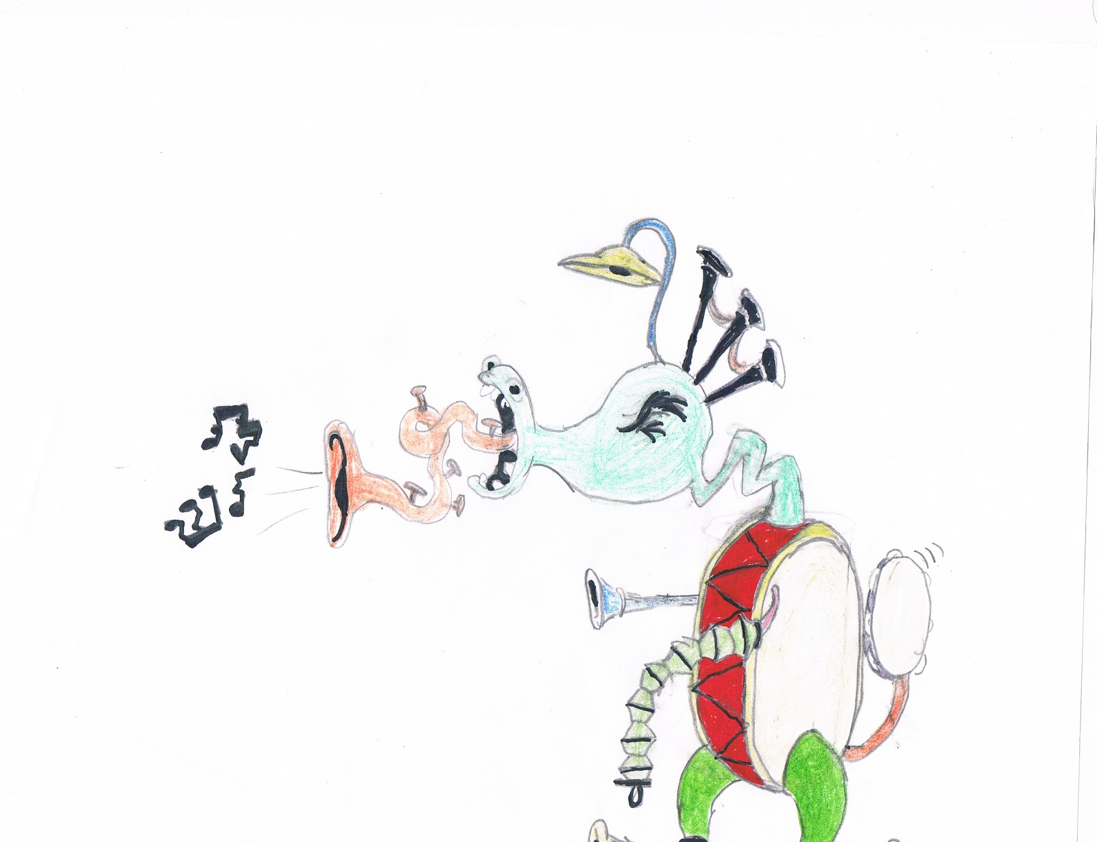
This piece, a 1928 collaborative effort by Yves Tanguy, Man Ray, Max Morise, and Andre Benson ; and created with pen, brown ink, graphite, and colored crayons on paper, displays a bizarre-looking figure with an appearance that defies all description, with distored limbs and various objects standing in for limbs.

 I think the first most noticeable detail in this piece is the weird contraption in the place where the figure's right arm should be, which gives a very inhuman quality to something that seems inhuman to start with. The next most noticeable detail, I think, is the figure's body, shaped like a human heart, complete with a protruding artery. Finally, one should take notice of the serpentine creature slithering between the figure's legs.


Considering this piece is little more than a woman's face made of various objects, I don't have very much to say in terms of Concept and Composition in this case.

I liked this piece, however, because it seemed very unique among the other works that were created with the usual oils and pastels.

This untitled work was created by Francis Picabia in 1920 with the use of various bits and pieces of junk, such as matchsticks, hairpins, coins, and string.


White Nurse, I feel, has a lot of social commentary in it, seemingly speaking out against the Vietnam War ( the army helmets) and the Klu Klux Klan ( the three crucifixes and the title, White Nurse).

Peter Saul created this piece with graphite on ivory wood pulp board, and colored  with oil pastel, crayons, and fiber-tipped and ballpoint pens.

I think the first detail that should call people to attention would be, of course, the central figure, since it is the single most noticeable detail in the piece. The second, the gigantic  phallic object that trails from from the left side of the canvas to the other, which should stand out with its bright yellow hue. Finally, one should take notice of the duck near the top, which seems almost out of place. 
          Now, out of the the works of art that I have selected that I consider a true masterpiece, I have chosen Salvador Dali's 1937 oil on canvas piece, Inventions of the Monsters. The reason I think this one is the best out of the others is that Dali's work is widely considered to be the most surreal in the world of art, and, as I have mentioned before, I hold an immense admiration to surrealism. Unlike Exquisite Corpse, however, this piece seems to hold some actual substance to it, as an outcry against war, much like White Nurse.  It also seems that Dali is recording a dream in this work, as explained in the art description above.

          The piece shows a winged  figure wearing a mask, crouched berfore a horse-headed creature rising out of a wooden block, apparently offering it something. While this takes place, various monstrous shapes dance about them in a post-apocalyptic landscape.

The detail I think people should notice first should be the flaming giraffe off to the side, either an animal who has been set about by the monsters with torches, or a monster itself. The second detail, I think, should be the score of horselike creatures, apparently partaking in some sort of demonic ceremony. The final detail people should notice should probably be  the ghostly image of a dog, who either looks upon the whole scene in morid curiosity, or is frozen with terror.


Tuesday, October 2, 2012

Week 6- Fifth Portoflio

To begin with, I have decided to title my series as "Pencil People", since they are drawn with pencil and are mostly figure drawings.

 What I have done for this week are drawings drawn on different surfaces than what I usually draw on, such as cardboard....

Pick a Card

...mathematics paper...
Blockbot

...and post-it notes.
Mailbox Beast


I have chosen to go into detail on the post-it note drawing since it seems to me to be the most unusual among the ones I have done. 

I attempted to create the picture by sticking the notes to each other, but because they would not stick well, I chose to tape them together. I also taped over any part of the notes that had glue on them so that I would not risk making the picture look ugly. The actual drawing process was much more simple, since the tape was easier to draw over, and to erase markings from, than I thought it would be. I chose to draw something involving a mailbox as a play on words; that is, "post".  

What I have drawn here is a mailbox with a reptilian monster dwelling within, who has apparently just finished off dining on a mailman, whose bones lie beneath the mailbox. The monster peeks out of the box, his clawed hands opening the cover ever so slightly; his eyes mere spots of lights within the dark box; and his scaly dragonlike tail dangling from out of the box.


What should be especially noticeable at first glace should be the creature's claws gripping the cover of the box, his tail dangling out, and his staring eyes. The second most noticeable thing should be the bones of the unfortunate postman, the hat still on his fleshless skull. Finally, the last thing you should notice should be the droplets of blood on the cover of the mailbox, indicating that the postman's fate was a messy one.  


Tuesday, September 25, 2012

Week 5- Fourth Portoflio

..in the Box"
"Jack...
 For this week's blog entry, I have created a diptych, two images that are meant to be viewed side-by-side, typically attached to each other by a hinge. Since they are usually
viewed from left to right, I have arranged the two images as you see here. 


                                                This pair of images portrays 
Pincher showing off his new Jack-in-the Box to his buddy, Poker, or, as Jack calls him, Dinner.

   These images were created in my usual medium of paper and pencil, and outline with black marker. I originally had intended Poker mishandling a crossbow and accidently shooting Pincher in the head with an arrow, but I found that a crossbow would be too difficult to draw.


    I designed these works to be viewed from left to right, as I described above, with the eyes following Jack-in-the Box's spring from the box to its head. In addition, the smirk on Pincher's face indicates that he intended for this to happen, the twisted look in the clown 's eyes indicates a ravenous, feral hunger, and Poker's body dangling from Jacks mouth looks as if Poker has been killed and has gone stiff. 

Tuesday, September 18, 2012

Week 4-Third Portfolio

 This week, on the heels of the world of superheros and villains, and since  I figured that since most villains are monsters, I would find it suitable to follow my previous drawings up with a drawing of a pair of monsters.

Need a Hand?

These two creeps are Pincher and Poker, two gremlins with the uncanny ability to remove their body parts at will. I first drew them in high school when I was doodling in my notebook. It was the Halloween season, so I had ghosts and ghouls running through my mind.

   As with the the rest of my drawings, this one was created primarily with paper and pencil. For this drawing, however, I decided to outline them in pen to give them an appearance similar to cartoons of the 1950's. Not to mention, it makes them stand out against the paper.

What I feel should be most noticeable in this cartoon should be the dialogue. Since it is at the top of the picture in big letters, I feel it would be what captures the viewer's eye. What should also be easily noticed is P and P's burlap bag shirts, which would suggest that they lead quite feral lives, living in dark alleys and under bridges. Finally, the third thing to be noticed should be their facial expressions and the positions they are drawn in, which is telling that they aren't exactly all there.


Monday, September 10, 2012

Week 3- Second Portfolio

The Frightster, Jacob Lantern, and Vincent the Bat
  The drawing I have chosen to go into detail about this week is of this villain, the Frightster.
I made this, as per usual, with pencil and paper, which should give our villain and his minions an appearance similar to the illustrations in horror comics like Tales From The Crypt and The Vault of Horrors . I feel that the Frightster was quite difficult to create, since I wanted him to be scary, but not too nightmare-inducing. It was for this reason that I drew Jacob Lantern first, since I already had his initial design thought up right off the bat. I first considered his face to be wrapped in bandages like a mummy, but that seemed a bit too grisly, so I settled for a cheap Frankenstein mask to make it seem a tad more lighthearted.   

The Frightster, obviously, is a horror-themed villain in a similar vein to The Scarecrow of the Batman franchise. His disheveled and somewhat grotesque appearance, with his dirty trenchcoat and sneakers suggests a tragic backstory and a predictably gruesome lifestyle.

  
What is especially noticeable at first glance should be the Frightster's Frankenstein mask, which seems goofy, and, at the same time, ironically menacing. Also worth noting are his hook hand ( with a cork stuck on the end) and the other hand being covered by a rubber monster glove.


Piefaced Piper
Slugman

Double Dare


Herr Menevolence
Flyspeck

Fairy Scrodmother

Tuesday, September 4, 2012

Week 2- First Portfolio

One aspect of creating your portfolio is displaying your work online. I've scanned a series of sketches of original characters that I have done recently.  My favorite medium is loose pencil sketches.
Moosnail
Cow Creature
Snake
Live Objects

Wise Owl

The following drawings are all of characters I have created for my idea for a superhero cartoon about a character known as "The Twister," shapeshifting sidekick to superhero "Corporal Courageous". Since these are character concepts, composition isn't much of a factor here.
The Twister 
Corporal Courageous 
Dr. Psychosis 
Grease Greaser

Sir Ambrose Nothing
I believe that out of these drawings, this one is the best of them. I created him, as I have the other works seen here. I feel most comfortable using this medium because it allows me to go back and correct a mistake, or I feel something would look better if I took it in another direction.

  This drawing is Sir Ambros Nothing; an unmistakable villain with his black tuxedo and mechanical mandibles for hands; as well as, noticeably, a question mark for a head.I drew Sir Ambrose as you see here so that he could be made out to be of an indeterminate nature.

  What you see first should  be his head- a floating question mark- beneath a glass dome on his shoulders, which reveals the surreal elements of his physical being. This is a stark contrast to his tuxedo, which suggests a dashing man-about-town,but  his metal claws remind us that he isn't quite human.

I have other sketches and ideas for other characters, allies and villains, to populate this cartoon that I may post at another time.

Tuesday, August 28, 2012

Week 1-Intro

My name is R.G. Kresse. I am a student at Saint Xavier University in Chicago, working toward a bachelor's degree in Art and Design. I intend to use my degree to pursue a career in the field of animation.