Wednesday, November 28, 2012


Open publication - Free publishing - More drawings

Greetings. I have recently compiled much of my work into a magazine. It is officially known as The Doodle in print, but on the web, I have elected to title the web version Pencil People. I created the magazine through the use of Macintosh InDesign, a computer application that you may or may not have heard about. The magazine features many of my most recent pieces, as well as the stories behind many of my more obtuse pieces. Go ahead and give it a look.

Saturday, November 17, 2012

Special Edition Post- Art Gallery Visit

This week, I visited the campus art gallery for my portfolio class, and on display were the works of one Debra Kayes.

I didn't really know much about Debra Kayes until I visited this gallery. Mrs. Kayes apparently works as an art and design teacher at Chicago's branch of Collumbia College and as an art major for MUZZLE Magazine. She also has a post-bachelor major Certificate for Graphic Design that she received in 2009, and a master's degree in fine arts, painting and sculpture.

I found the pieces she created to be fairly interesting. She describes the inspiration for her works as thus:
" I make use of simple organic forms to explore the ways in which creatures large and small group to gain safety in numbers. Layered and repeated elements allow individuals to act as one. Yet, through investigating patterning techniques like emergence, gang-mentality, and swarm theory, I have also found interest in the benefits of biodiversity, abnomaly, and metamorphosis. My approach intentionally forces me to be perceptive and open to change, with moments of hilarity, so I can discover modification and mutation, speaking to the fluid nature of groups quickly adapting based on local information." 

 Atlas of Men is mixed media , which would appear to be Mrs. Kayes' favorite method of creating art, comprised of wood and paint. I think what Kayes did with this piece was look at the cut of wood and see different, naturally-formed shapes as peoples' silhouettes, and colored them in.

 I believe that the idea that Kayes is trying to convey here is camouflage; how animals blend in with their surroundings. I believe that the title itself ties into this theme in that people often try to conform to some standard, much like how an animal uses camouflage.


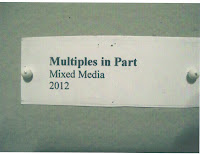
Multiples in Part, I think, was rather interesting, being made from folded up tissue paper and printer paper to resemble a reef of various corals. I believe that the title of this piece refers to how structures of coral come in separate groups, but are all connected in a way.


See/ Sea seemed like a very inexplicable piece, being various painted wooden blocks arranged in piles about the room. I feel that this relates to animals' methods of safety in numbers in that animals in large groups will often scatter about so that it will make it harder for a predator to get them. The title, I believe, refers to how this method is practiced mostly by marine animals, such as fish, and it makes them difficult to find.


     This final piece, Account, I found to be the most interesting , being, at its core, a giant wall of paper hands that must have been exceedingly difficult to make them all exactly alike and arrange them as neatly as possible.  In short: it seems simple, yet complex.
         
     I believe that the theme of this piece is how large groups of similar-looking animals will come together as one to avoid being attacked by predators, who see them as bigger than they really are. The title alludes to importance and worth, which you would think a small creature would lack until a great number of them come together in a large group.

Sunday, November 11, 2012

Week 12-11th Portfolio

For this week's assignment, I was tapped to create an image portraying a representation  of a common saying or expression taken literally.

The saying I have portrayed here was "Shooting fish in a barrel", with a shady-looking man pointing a gun, ready to fire, into the mouth of a barrel of fish down at the docks.

I created this piece with pencil and paper, and gave it color through the use of colored pencils. I elected to outline the man and the barrel with black pen to make it stand out against the background. I had numerous ideas about what saying I could adapt into a literal representation of it. I had pondered over "I'm so hungry I could eat a horse", "Mind your P's and Q's", "Don't look a gift horse in the mouth", and "Poor fish". That final idea triggered my decision to use the one that I went with. 

The first detail that should capture the viewer's attention should be the very essence of the gag. There's the gun, there's the barrel labeled "fish"; do the math. The next most noticeable detail in this piece, I think should be the man who's about to shoot the fish. The clothes that he's wearing, as well as his bald head, suggests that he lives a life of piracy. The striped shirt he wears is very similar to the ones worn by buccaneers in so many pirate stories. The final detail to be noticed is the setting. The darkened building off to the right and the discarded rope and bottle suggests that this is sort of the "bad part" of town. 

Tuesday, November 6, 2012

Week 11-10th Portfolio

I was assigned this week to create a piece that featured numbers in it, so I came up with this piece:
Multiplying...
   I created this, as usual with pencil and paper, and colored and outlined it with colored pencil. I came up with the image when I figured that the piece needn't be specifically about numbers, but just have numbers in it. When I think of numbers, I usually think of math. Thus, multiplying, which I worked into a visual pun: "multiplying like rabbits". However, as some of my peers suggested, I included some more rabbits in the background to have it make sense a bit more.

  What I have created here is a brown-furred, blue-eyed rabbit puzzling over a scoll with a near-impossible multiplication formula. He holds a pencil in one paw as question marks swirl about his long-eared head like flies on a summer day.

  What should be noticeable first in this piece should be, I think, the equation that the rabbit is working on. I did used a calculator to perform the equation and wrote down my calculations as I went along, for the sake of accuracy. The next thing to notice should be the expression on the hare's face, which suggest concern or befuddlement. While the viewer looks over these details,  they will probably notice the third element: the pun. Get it? Multiplying like rabbits? Tee-hee-hee.